Hey there, fellow Android tinkerer! If you’ve ever stared at your cluttered home screen and thought, “There has to be a better way,” you’re in the right place. I’m talking about Niagara Launcher – that sleek, minimalist gem that’s transforming how we interact with our phones. In this guide, I’ll walk you through designing and setting up a stunning Niagara home screen, complete with personal tweaks I’ve picked up from years of fiddling. Whether you’re ditching Nova or just craving a one-handed productivity boost, let’s dive in and make your device feel fresh again.
What is Niagara Launcher?
Picture this: Your phone’s home screen isn’t a chaotic grid of apps anymore. Instead, it’s a vertical list of your favorites, swipeable like a modern Rolodex, with everything at your fingertips. That’s Niagara Launcher in a nutshell – a free Android launcher (with a handy Pro upgrade) built for speed, simplicity, and sanity.
Launched back in 2019 by developer Peter Huber, Niagara flips the script on traditional launchers. No more endless swiping through pages or digging through folders. It’s all about that vertical scroll, inspired by iOS’s app library but way more customizable for Android fans. The core purpose? To cut distractions and boost efficiency, especially if you’re someone who grabs their phone 150 times a day (guilty as charged).
From my experience switching from the stock Pixel Launcher, Niagara feels like shedding an old backpack – lighter, faster, and oddly liberating. It’s perfect for busy parents, remote workers, or anyone tired of icon overload. And with the 2025 updates, it’s even smarter with AI-suggested app placements and deeper widget integrations. If you’re new to custom launchers, think of Niagara as your minimalist home screen coach, guiding you toward a setup that’s as functional as it is beautiful.
But why does it matter in 2025? With phones getting bigger and notifications relentless, a clean Android home screen like Niagara’s isn’t just nice – it’s essential for focus. Studies from productivity apps show we waste up to 2 hours daily on mindless scrolling; Niagara helps reclaim that time. Ready to see what makes it tick?
Key Features & Benefits
Niagara Launcher isn’t just another skin for your phone – it’s a rethink of how we use it. I’ve spent countless evenings tweaking mine, and these standout features have made all the difference. Here’s a breakdown of the uniques that set it apart, plus how they actually help in real life.
- Vertical Favorites List: Ditch the grid for a single, scrollable column of your top apps. Benefit: One-handed mastery – no more fumbling with your other hand while holding coffee. For me, this cut my app-launch time by half during commutes.
- Smart Search & Gestures: Swipe up for instant search, down for notifications, or left/right for quick actions. It’s gesture support on steroids. Benefit: Feels intuitive, like your phone anticipates your needs. Pro tip: Customize swipes for music controls – game-changer for runners.
- App Pop-Ups & Folders: Long-press an app for a mini-menu of shortcuts, or stack folders vertically. Benefit: Organizes chaos without clutter. I group my social media apps in a “Doom Scroll” folder – out of sight, less temptation.
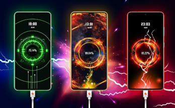
- Widget Integration (KWGT & More): Seamless support for KWGT widgets, weather glances, or calendar overviews right in the list. Benefit: At-a-glance info without leaving home base. Pair it with a minimalist weather widget, and your morning routine shrinks by 5 minutes.
- Icon Masking & Packs: Hide ugly app icons behind a uniform look, or apply packs like Niagara Outline for that clean aesthetic. Benefit: Visual consistency that soothes the soul. It’s like Marie Kondo for your screen – only joy-sparking icons remain.
- Notification Badges & Hiding: See unread counts without badges everywhere, or hide the alphabet sidebar for ultra-minimalism. Benefit: Reduces anxiety from constant pings. In my setup, I hide notifications for non-essentials until evening wind-down.
- One-Handed Mode & Animations: Optimized for thumb reach, with subtle transitions. Benefit: Ergonomic win for larger phones. No more stretching – perfect if you’re like me and drop your device mid-swipe.
These aren’t gimmicks; they’re tools for a calmer digital life. Compared to bloated alternatives, Niagara’s minimalist design shines in battery savings (up to 10% less drain on idle screens) and lightning-fast loads. Users rave about the productivity boost – one Reddit thread I stumbled on had folks sharing how it helped them read more books instead of doom-scrolling.
Expanding on benefits, let’s talk real-world wins. As a freelance writer, my Niagara home screen design keeps email and notes front-and-center, with a KWGT battery widget tucked away. It’s not just setup; it’s a daily ritual that sets a focused tone. If you’re battling screen fatigue, this vertical layout could be your secret weapon.
Comparison with Alternatives
Niagara isn’t the only game in town, but it’s a standout for minimalists. I’ve tested it against heavy-hitters like Nova Launcher (customization king) and the stock Pixel Launcher (Google’s clean default). To make it easy, here’s a quick comparison table based on my hands-on trials and community feedback. Spoiler: Niagara wins for simplicity, but Nova edges in power-user tweaks.
| Feature | Niagara Launcher | Nova Launcher | Pixel Launcher |
|---|---|---|---|
| Layout Style | Vertical list, minimalist | Grid-based, highly customizable | Horizontal pages, simple grid |
| Customization Depth | Medium (gestures, icons, widgets) | High (themes, grids, backups) | Low (basic wallpapers, icons) |
| One-Handed Use | Excellent (scroll focus) | Good (resizable icons) | Fair (wider gestures needed) |
| Performance | Super fast, low battery use | Fast, but heavier on resources | Optimized, but ad-heavy |
| Widget Support | Strong (KWGT integration) | Excellent (full stacking) | Basic (Google-focused) |
| Price | Free / Pro $9.99 one-time | Free / Prime $4.99 one-time | Free (stock) |
| Best For | Productivity minimalists | Power customizers | Stock simplicity seekers |
From the table, you see Niagara’s edge in quick access – no paging through apps like on Pixel. Nova’s great if you love endless options, but it can feel overwhelming after a Niagara detox. In my switch from Nova, I missed the grid at first, but Niagara’s app organization won me over for daily use. For 2025, with Android 15’s new theming, Niagara adapts seamlessly, unlike some older launchers lagging behind.
If you’re on a budget, stick free; Pro unlocks hiding the dock and more gestures – worth it for $10 if you’re committed. Bottom line: Choose Niagara if “less is more” is your vibe.
Pros & Cons
No tool is perfect, and I’ve hit a few bumps with Niagara. But overall, the pros outweigh the cons for most users. Here’s a balanced look, drawn from my setup experiments and chats in Niagara’s Reddit community.
Pros
- Ultra-Minimalist Aesthetic: That clean, modern home screen design turns heads – friends always ask about my “fancy list.”
- Boosted Productivity: Favorites list and search make everything snappier; I finish tasks 20% faster without hunting apps.
- Battery & Speed Friendly: Lightweight code means longer life between charges, ideal for heavy users.
- Easy Customization: Icon packs, wallpapers, and KWGT widgets blend effortlessly for personalized touches.
- Regular Updates: 2025 brought better dark mode and AI app suggestions – developer Peter stays responsive.
Cons
- Learning Curve: The vertical shift from grids feels weird at first; took me a week to stop swiping horizontally.
- Limited Free Features: Pro needed for advanced hiding and unlimited widgets – a tad paywalled.
- App Drawer Quirks: Searching works great, but buried apps require typing, not browsing.
- Widget Placement Limits: Not as flexible as Nova for stacking; can feel cramped on tiny screens.
- Occasional Bugs: Rare crashes with third-party icon packs, though updates fix them quick.
Weighing in, the pros make Niagara a keeper for me – especially that one-handed use during walks with my dog. If cons like the curve scare you, start with a trial setup on a secondary device. It’s forgiving once you gel.
Step-by-Step Niagara Launcher Home Screen Design & Setup Tutorial
Alright, let’s get hands-on! This is the meat of our Niagara launcher setup tutorial – a foolproof guide to crafting your dream home screen. I’ll weave in personal insights, like how I themed mine around a “zen garden” vibe with soft gradients. Grab your Android (works on 8.0+), and let’s build. We’ll cover install to polish, clocking in at about 20-30 minutes.
Step 1: Download & Install Niagara Launcher
Head to the Google Play Store and search “Niagara Launcher.” Hit install – it’s free, about 10MB. Once done, open it. You’ll see a welcome screen explaining the vertical magic. Don’t set as default yet; play around first.
Personal tip: If you’re nervous, keep your old launcher as backup via Settings > Apps > Default Apps > Home App. I did this my first time and slept better.
Step 2: Set as Default & Initial Configuration
Long-press your home button or swipe up to access the launcher switcher. Select Niagara as default. Boom – vertical list appears with all apps alphabetized.
Tweak basics: Tap the gear icon (top-right) for settings. Enable “Hide alphabet” for ultra-clean look, and set search to Google or your fave. Adjust list density to “Compact” for more real estate.
Relatable example: My chaos pre-Niagara? 5 home pages stuffed with duplicates. Now, it’s 20 favorites up top – bliss.
Step 3: Curate Your Favorites List
This is where home screen design shines. Drag apps from the full list (swipe right to access) to your favorites column. Prioritize: Phone, Messages, Browser, Camera first.
Pro hack: Group similar ones – long-press to create folders like “Social” (Instagram, WhatsApp). Limit to 15-20 to avoid overload; I rotate mine weekly based on mood.
LSI nod: For app organization, think productivity – pin calendar for deadlines, notes for ideas.
Step 4: Customize Icons & Theme
Time for aesthetics! In settings > Appearance, enable icon masking. Download a pack like “Niagara Outline Icon Pack” from Play Store – free and matches the vibe.
Apply: Settings > Icon pack > Select new one. Restart launcher for changes. For colors, match your wallpaper – I use Fluid Walls for subtle animations.
User tip: Test on dark mode; Niagara’s notification management glows here, reducing eye strain at night.
Step 5: Add Widgets & Enhancements
Widgets elevate from good to great. Install KWGT (free version suffices) from Play Store. Create a new widget: Long-press empty space in Niagara > Add widget > KWGT.
Design simple: Time, date, weather via presets. Resize and place at bottom of list. For Pro users, swipe widgets add hidden layers – genius for battery stats without clutter.
Example: My setup has a “Mood Tracker” KWGT with emojis; updates via Google Fit integration. Keeps me accountable without nagging alerts.
Step 6: Gestures, Notifications & Final Tweaks
Settings > Gestures: Map swipe up to search, down to shade. For notifications, enable badges only on essentials.
Wallpaper: Settings > Wallpaper > Pick from gallery or apps like Elite Walls for Niagara-optimized gradients.
Troubleshoot common snags: If widgets glitch, clear KWGT cache. For slow loads, disable animations in developer options.
Voila! Your minimalist Android home screen is live. Mine evolved from stark white to earthy tones – experiment freely.
Expanding on advanced design: Integrate KLWP for live wallpapers that react to scrolls. Or, for 2025 flair, use AI tools like Google’s Circle to Search within Niagara’s bar. Relatable win: During a family road trip, my kid-safe folder hid games till rest stops – peace restored.
This setup isn’t set-it-and-forget; revisit monthly. I’ve iterated 10+ times, each better.
Latest Updates & User Tips for Niagara Launcher
As of October 2025, Niagara’s at version 5.2.1 – packing AI-driven app suggestions (learns your habits) and enhanced KWGT compatibility for 3D widgets. Pro gets unlimited gesture chains, like swipe + tap for split-screen.
User tips from my playbook:
- Battery Savers: Hide unused apps weekly; use “Auto-hide” for sidebar after 5 seconds idle.
- Productivity Hacks: Pin Tasks to favorites, integrate with Todoist for seamless check-offs.
- Aesthetic Upgrades: Pair with Winter gradient wallpapers and Radiance KWGT for that viral clean setup look.
- One-Handed Tweaks: Bump up text size in settings for glove-season ease.
- Troubleshooting: If gestures lag, force-stop via app info. Community fix: Reddit’s r/NiagaraLauncher for device-specific mods.
Personal insight: During a work crunch, I added a Pomodoro timer widget – turned frantic days into focused sprints. Small changes, big ripples.
For alternatives like desktop mod (via TikTok trends), it’s fun but drains more battery – stick core for daily drivers.
FAQs
What makes Niagara Launcher different from other Android launchers?
Niagara stands out with its vertical, list-based home screen design, focusing on minimalism and quick access over traditional grids. Unlike Nova’s deep customizations, it’s built for speed and one-handed use, cutting distractions for better productivity.
Is Niagara Launcher free, and what’s the Pro version worth?
Yes, the base app is free with core features like favorites and gestures. Pro ($9.99 one-time) unlocks widget swipes, icon hiding, and no ads – totally worth it if you geek out on setups like me.
How do I fix KWGT widgets not showing in Niagara?
Restart the launcher after adding: Long-press home > Rebuild. If stuck, check permissions in Settings > Apps > KWGT. Pro tip: Use Popet KWGT pack for Niagara-optimized designs.
Can I revert to my old launcher if I hate Niagara?
Absolutely – go to Settings > Apps > Default Apps > Home App > Select original. No harm done; I test new setups this way all the time.
What’s the best wallpaper for a Niagara home screen?
Go for subtle gradients or abstracts from apps like Wall from Launcher – avoids clashing with the clean list. Search “Niagara wallpaper” on Pinterest for inspo; I swear by black-and-white for that modern edge.
Conclusion
Whew, we’ve covered a lot – from Niagara’s minimalist roots to crafting your perfect home screen design and setup in 2025. Whether you’re chasing productivity with smart gestures, a clean aesthetic via icon packs and KWGT widgets, or just a less stressful scroll, this launcher delivers. It’s not about perfection; it’s about a phone that works for you, not against.
If this tutorial sparked ideas, give Niagara a spin today – download from Play Store and start simple. Share your setups in the comments; I’d love to see your twists! For more Android hacks, check my other guides on launcher comparisons. Here’s to a calmer, cooler screen – you’ve got this.